CASE STUDY / VISUAL DIRECTION
Tirma:
taste
becomes an image.
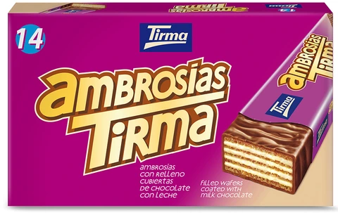
Tirma is a food company founded in Las Palmas de Gran Canaria in 1941. Its range spans chocolate, coffee, cocoa, biscuits and sweets, but the milk chocolate bar and Ambrosías are the main starting points for this case study.
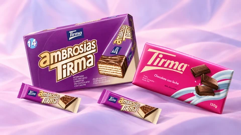
The project explores how to turn simple product photographs into a system of images and cinematic sequences for commercials. Packaging, bars and individual details are recreated as controllable assets that support camera movements, lighting changes, different sets and short formats for digital communication.
The aim is to extend production possibilities from basic materials while keeping products recognisable. Chocolate macros, breaks, wafer layers and moving packs build a story in which texture, indulgence and visual identity become the very substance of the commercial.
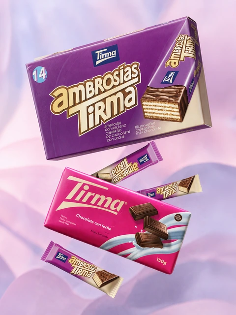
From product photo to cinematic sequence
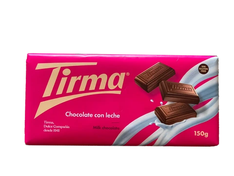
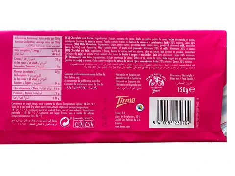
The first film tests the method. Front and back photographs of the bar are used to recreate clear, consistent packaging, then place it in a sequence alternating reveals, rotations, approaches and close passes over the product’s surface.
Direction goes beyond animating the packaging: light, depth, rhythm and camera movement turn static material into a short advertising cinematic. The pack’s pink becomes the setting, while chocolate introduces contrast, substance and focal points.
01 / TIRMA CHOCOLATE
Inside the substance of chocolate
The front and back of the packaging define the first level of precision: proportions, logo, hierarchies, colours and details must remain stable as the product changes position, scale and lighting.
The second level concerns the bar outside its packaging. The shape of individual squares, the embossed mark, thickness and chocolate surface are recreated to support macro shots and viewpoints absent from the original photographs.
Breaking the bar reveals its cross-section and introduces fragments, irregular edges and cocoa powder. The camera can then approach the material and turn texture, sheen and detail into narrative elements, emphasising the product’s sensory qualities.
02 / AMBROSÍAS
Layers, gesture and character
With Ambrosías, the system spans the multipack, single snack and opened product. Wafer, cream and milk chocolate coating form a precise visual structure: layers, cross-section and surface guide macros, rotations and camera moves skimming the surface.
The cinematic sequences alternate the full pack, the isolated bar and the wafer in small sets built around the brand’s purple. Opening, waiting and product discovery set the pace; light and depth highlight the contrast between the crunchy interior and outer coating.
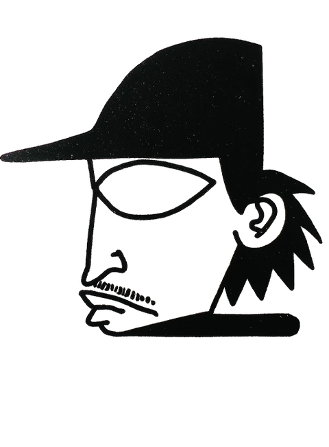
To expand the story, I also created an original avatar, developed through consistent facial views and integrated into a dynamic urban scene. The character introduces gesture, movement and human scale, connecting the more technical images to a potential lifestyle and social media language without replacing the product.